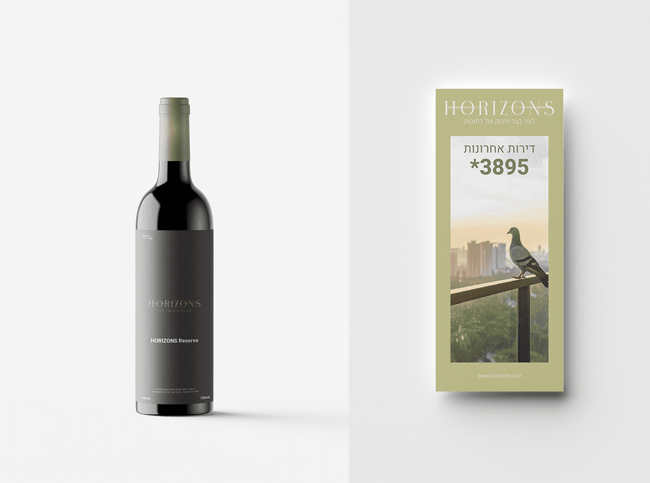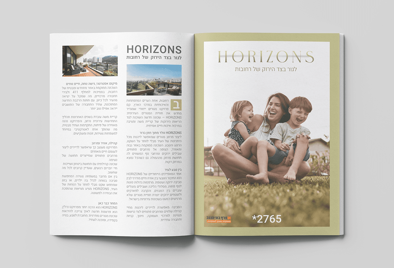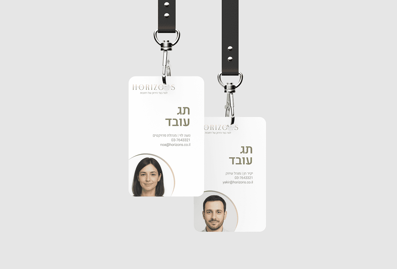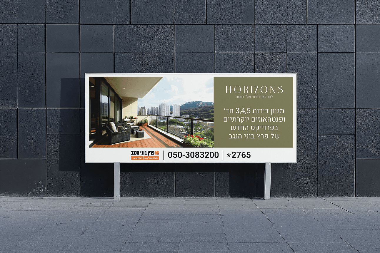
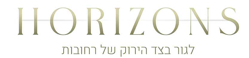
HORIZONS
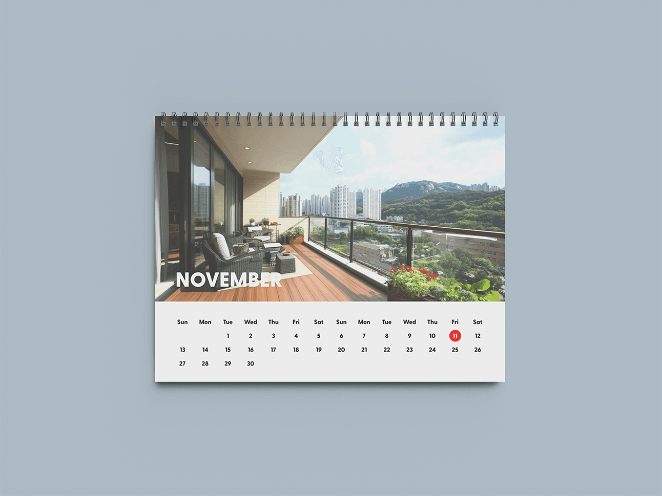
Live on the Green Side of Rehovot.
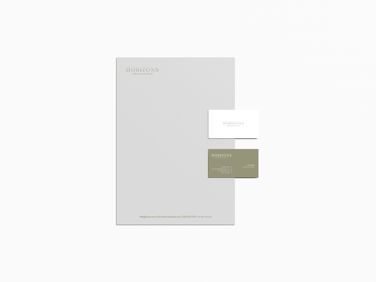
Logo / Visual Identity / Graphic design
The branding of HORIZONS was built around the idea of balance — between city and nature, design and calm, clarity and space.
Inspired by the horizon line, the logo’s elongated forms and softened geometry express openness, movement, and quiet luxury.
A refined olive-gold palette bridges earth and light, symbolizing the project’s essence: contemporary urban living with a natural, elevated feel.
The gradient creates a seamless transition from soil to sky, evoking renewal, calm, and connection to the surrounding landscape.
Typography combines an adjusted Chagira logotype — reshaped for breath and flow — with a clean, modern sans-serif that grounds the brand in clarity and ease.
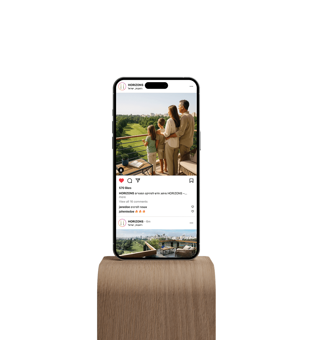
HORIZONS is more than a place to live — it’s a lifestyle rooted in nature, sophistication, and forward-looking design.
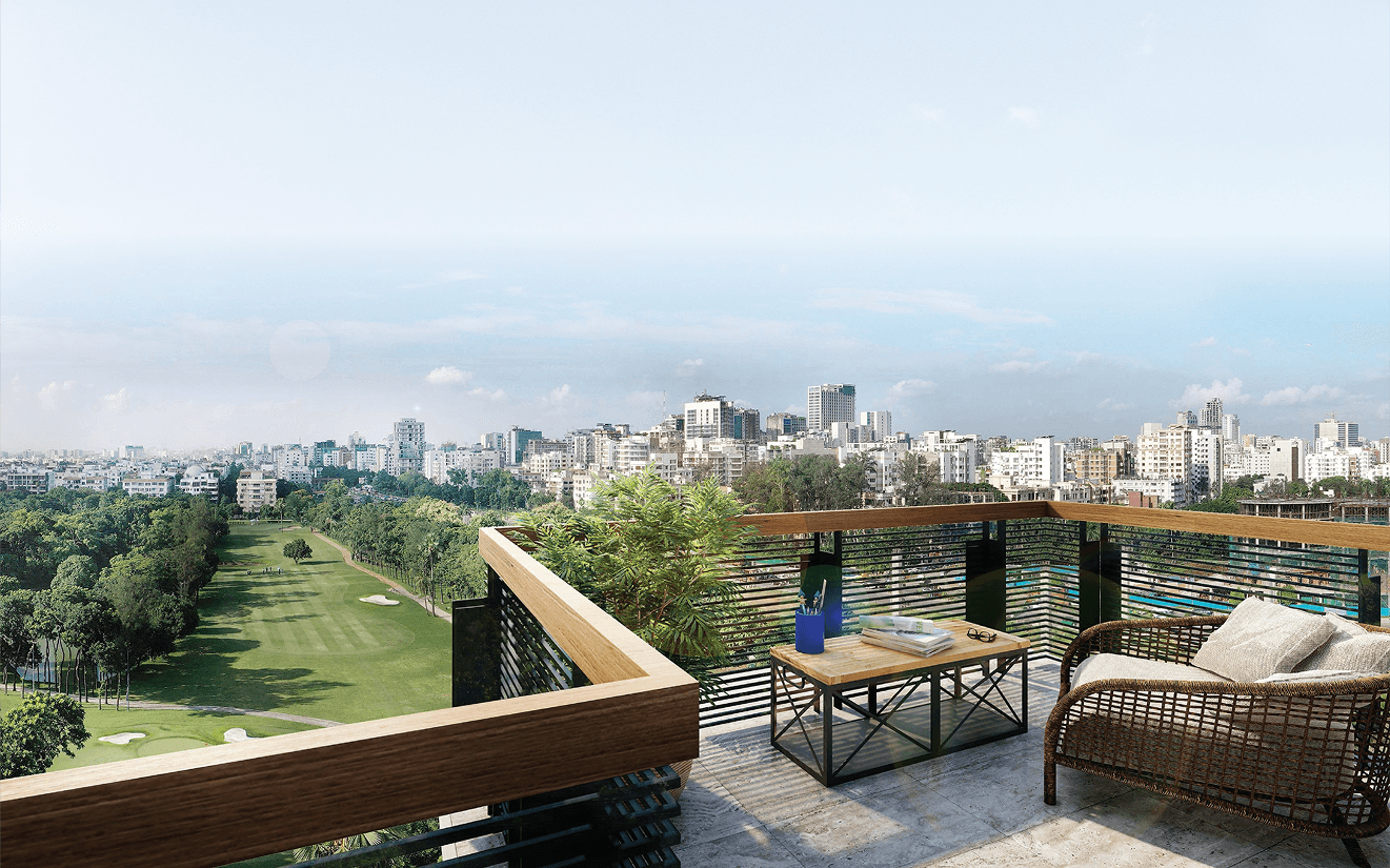
The branding of HORIZONS reflects a lifestyle where nature meets modern living — inspired by light, space, and the quiet rhythm of the horizon.
Soft gradients and open geometry evoke calm, continuity, and the feeling of breathing room in the city.
Each tone in the palette is drawn from earth, stone, air, and greenery — translating natural elements into a refined, contemporary visual language.
Rooted in nature. Designed for modern life.