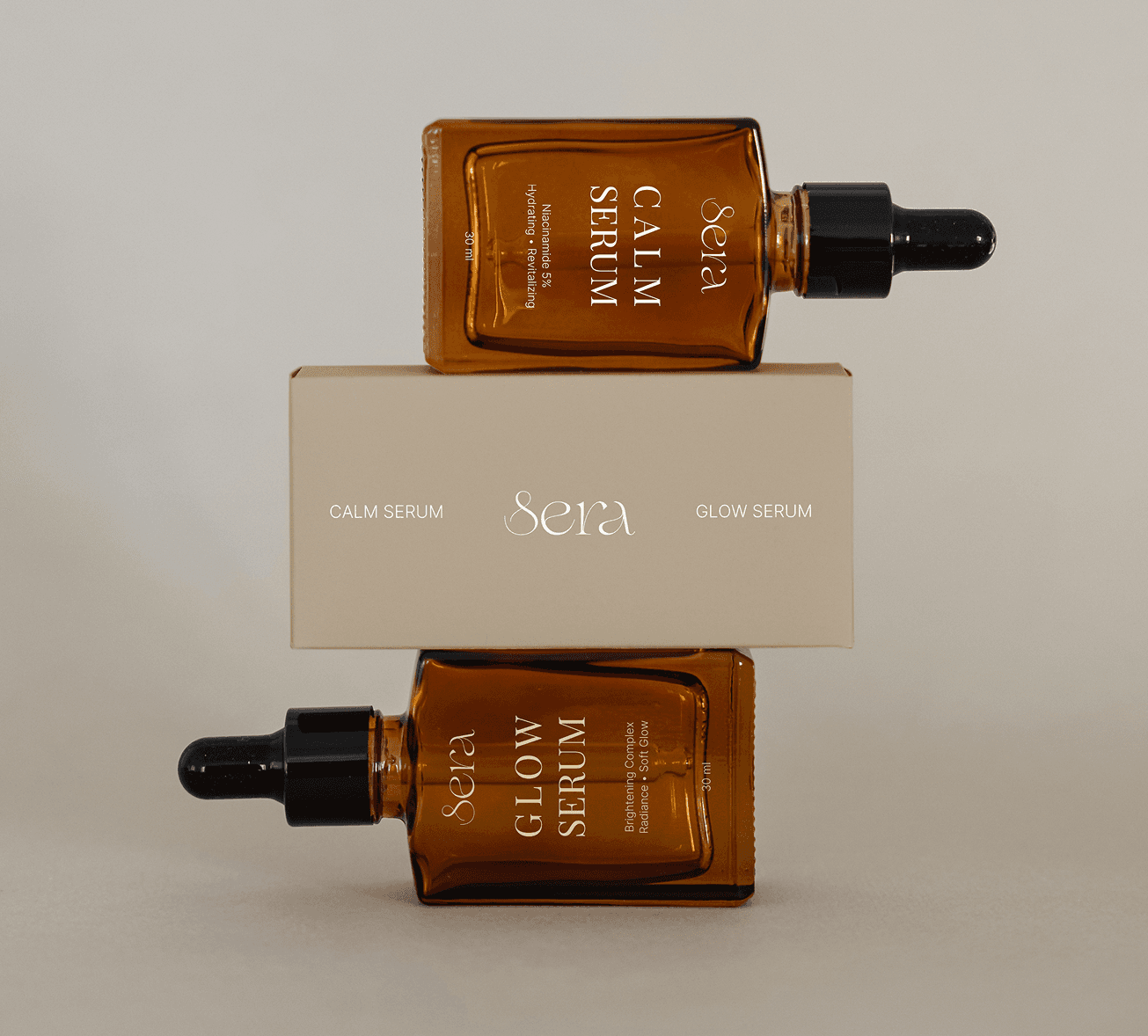
SERA
Calm. Simple. Human.
Branding / Visual Identity / Graphic design/Packaging
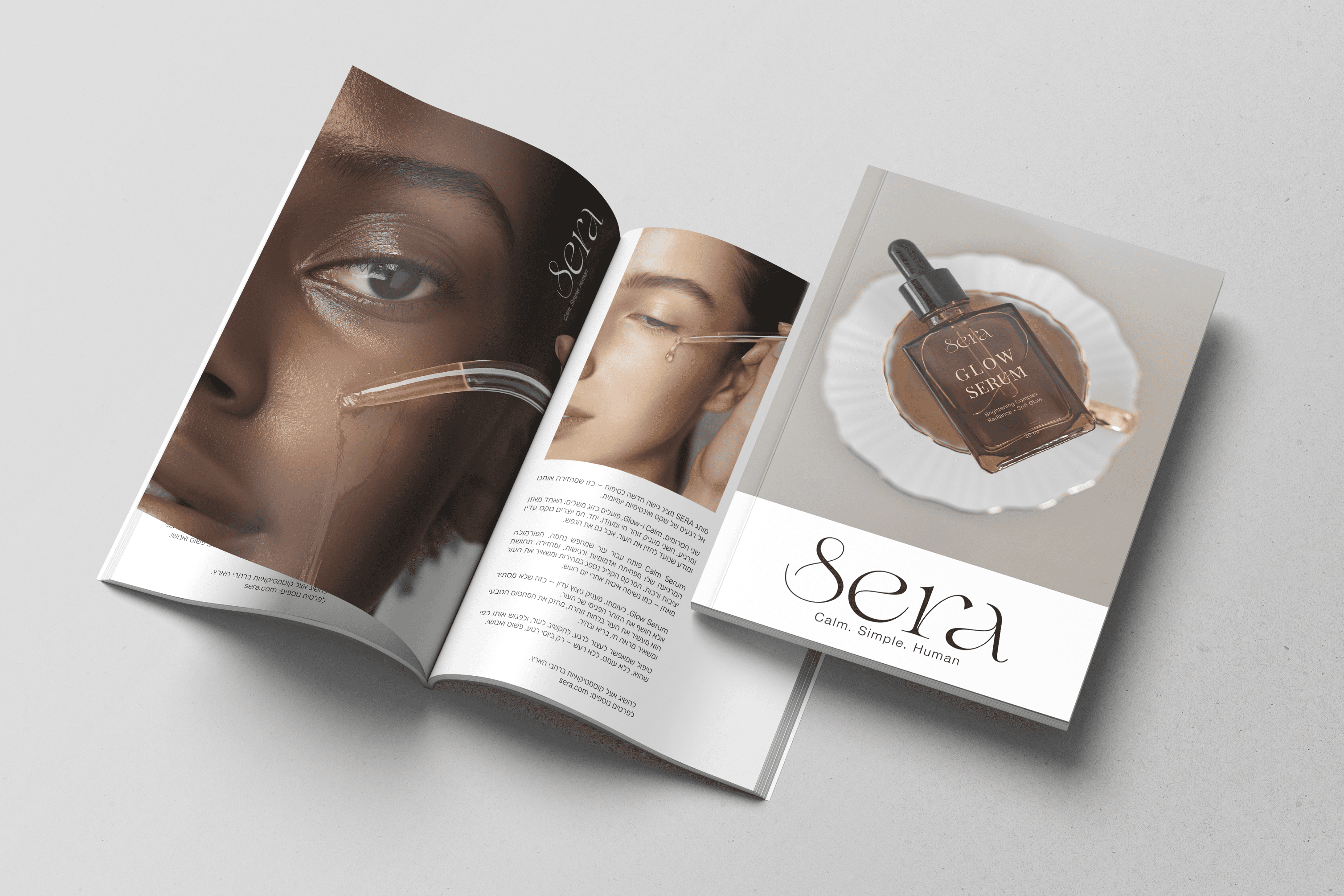
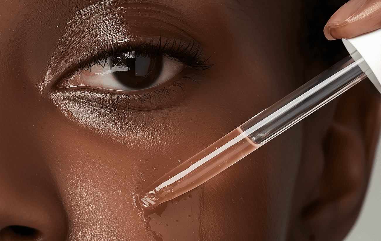
The SERA brand was created from a desire for conscious simplicity, skincare that feels effortless, intentional, and quietly restorative.
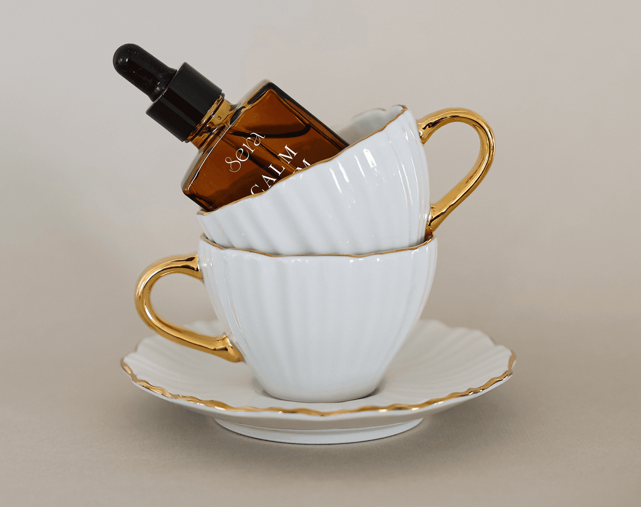
Warm amber glass meets soft, refined typography to express clarity, calm, and understated luxury.
The visual identity reflects the essence of the products: a balance between deep serenity and natural radiance, between grounding earthiness and modern purity.
The interplay of amber, delicate letterforms, and a neutral palette creates a sense of softness, precision, and human warmth.
The two serums, Calm Serum and Glow Serum, represent complementary states of being:
soothing and renewing.
Together, they form a paired ritual, two breaths in harmony, designed to bring ease, balance, and gentle luminosity to the skin.
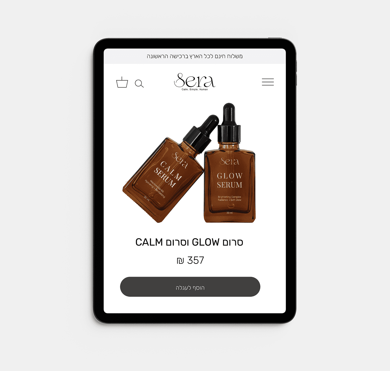
The minimalist labeling allows each product to stand on its own, free from noise or excess, offering a clean and effortless visual experience.

The branding of Sera is built around the idea of slow beauty, a calm, modern ritual that feels gentle, intimate, and effortless.
Inspired by warm amber tones and soft contours, the identity expresses
clarity, serenity, and quiet confidence.
The visual language combines refined minimalism with natural warmth, creating a sense of balance between purity and glow.
Each element — color, type, and form — is designed to feel soothing,
elevated, and quietly luxurious.